


We Spent Hours Debating Empty States. Nobody Had Data.
For three years, I was a senior UX designer at Equinor, one of Europe's largest energy companies.
Our team spent hours debating questions like: Should error messages be apologetic or neutral? Should the button say "Add" or "Create"? Should we use a toast or inline validation?
Hours. Of. Debate.

Weekly UX and product design case studies. Trusted by designers from companies like Apple, Google and Spotify. It's 100% free.

Everyone had opinions. Nobody had data
And we weren't just solving it for ourselves. We were trying to standardize patterns across multiple teams. Good luck getting consensus when everything is gut feel.
So I got curious. How do the big enterprise systems actually solve this?
I started auditing leading products: Notion, Slack, Figma, Linear, GitHub, Stripe, and more. Not collecting screenshots. Collecting data.
I counted everything. And the findings were surprising.
Dashboards never say "No data yet"
When we designed empty dashboard states, we debated whether to show a friendly message or placeholder content. Turns out, nobody shows a message.
All 7 dashboard instances across the systems I analyzed show zeros instead: "0.00", "0 users", "0%". No system hides the structure. Zeros are data. They tell users the system is working, there's just nothing to show yet.
We spent an afternoon debating empty state copy for a dashboard. The answer was: don't write any.
Half the enterprise web has no "Request Access" flow
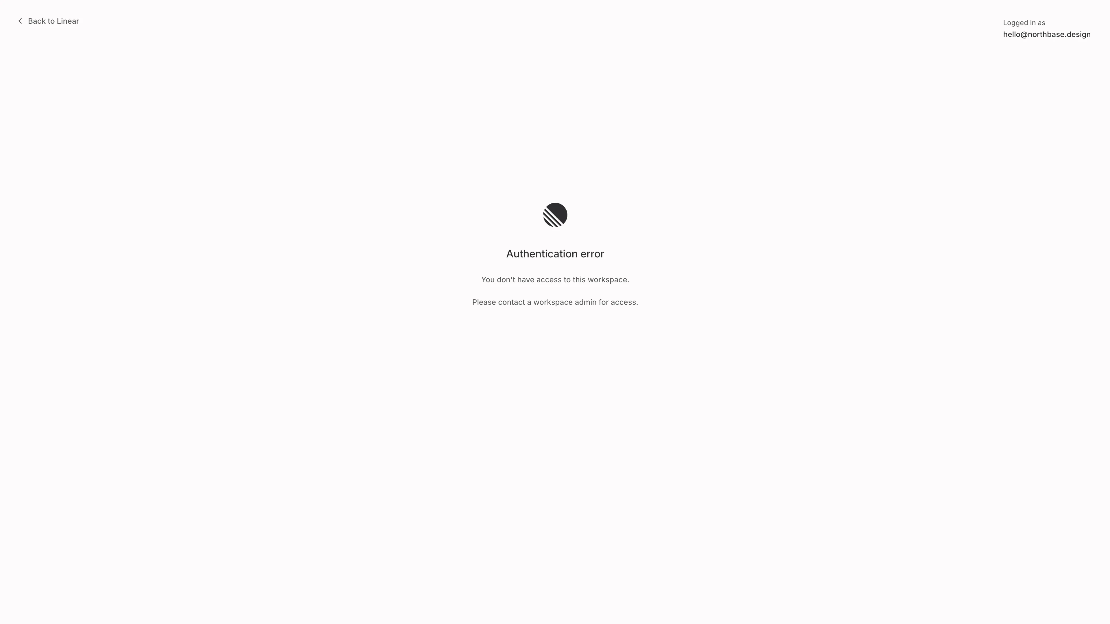
Only 5 of 10 systems let blocked users request access: Figma, Notion, Dropbox, Trello, and Atlassian.
GitHub, Slack, Linear, Airtable, and Asana? If you don't have access, you're stuck. Dead end. No path forward.
The systems that do offer request access can't even agree on the verb — "Request access" (Figma, Dropbox), "Send request" (Trello), "Join team" (Atlassian). But 4 of 5 show which account you're logged in as. Because "I can't access this" is often just "I'm signed into the wrong account."
7 of 12 AI products hide their reasoning
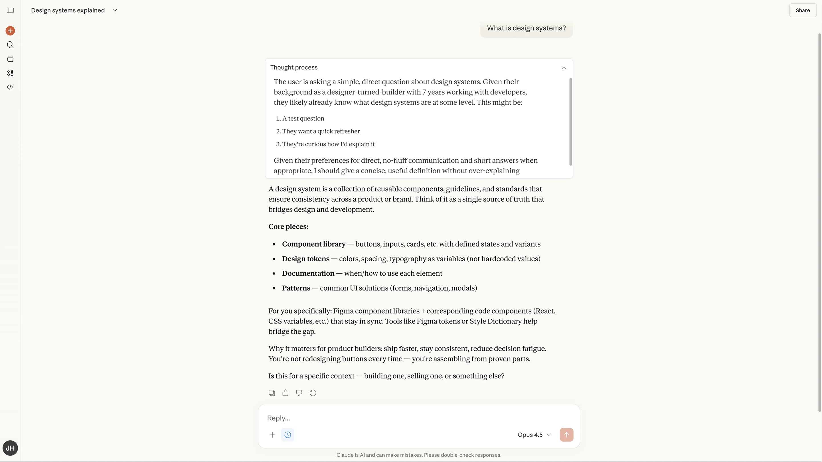
Most AI-powered products show a pulsing dot or "Thinking..." and nothing else. Only 5 of 12 show any reasoning transparency: Claude shows a collapsible "Thought process" section. V0 streams reasoning in real-time. Retool shows "Thought for 5 seconds" timestamps. Gemini and Perplexity offer expandable "Show thinking" toggles.
Transparency is becoming a trust signal, but most systems still treat reasoning as a black box.
That's what I've been building
This kind of research, systematic, quantified, across real enterprise products, is what I've been working on for the past year.
It's called Northbase.
Every pattern is analyzed across 10+ enterprise systems. Not opinions, butfrequencies, breakdowns, and decision frameworks you can actually use. So you can stop debating taste and start making decisions backed by data.
If your team has ever spent an hour arguing about a button label, a toast notification, or an empty state — this is the tool I wish we'd had.

